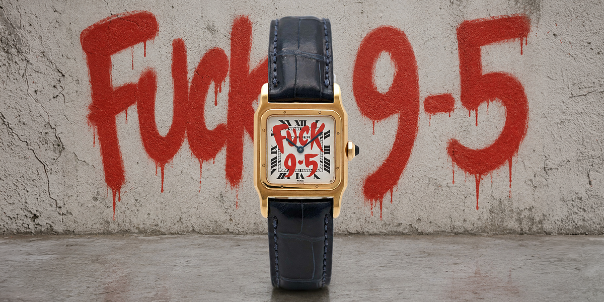
Fuck 9-5 Watch Review: The Anti-Corporate Statement Piece Entrepreneurs Are Wearing
Did you know the fuck 9-5 watch was basically created for entrepreneurs looking for a watch that fits their lifestyle better than that old desk

The Rolex logo ranks among the world’s most recognizable symbols of luxury and prestige. A closer look at the iconic gold crown above the Rolex name reveals a surprising fact – the company started with a different name. Back in 1905, the business began as Wilsdorf & Davis, named after German businessman Hans Wilsdorf and his brother-in-law Alfred Davis.
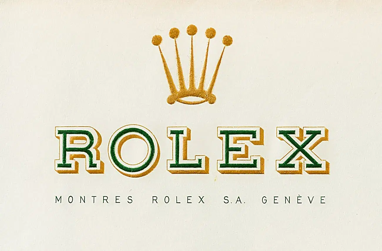
The name “Rolex” became a registered trademark in 1908. The famous five-point crown logo we know today made its first appearance in 1925. The Rolex crown logo has managed to keep its regal appeal while staying simple and timeless for almost a century. The golden crown represents the company’s dedication to precious materials, and the signature green symbolizes wealth and prosperity. The brand’s commitment to excellence shows in its numbers – Rolex produced about 1.24 million watches in 2023 alone.
Every iconic brand has a story that starts small. Rolex began its journey in 1905 as a small watch distribution company in London, England. Hans Wilsdorf was just 24 years old when he teamed up with his brother-in-law Alfred Davis, who was married to Ana Wilsdorf, to start their timepiece business.
The company started as “Wilsdorf & Davis” and specialized in importing premium Swiss movements made by Hermann Aegler. They placed these mechanisms into cases that other watchmakers, mainly Dennison, crafted. The company didn’t make their own watches but assembled timepieces for jewelers who put their own names on the dials. The earliest timepieces from this partnership showed “W&D” hallmarks inside their casebacks.
The brand name changed from Wilsdorf & Davis to what we know today when Hans Wilsdorf registered the trademark “Rolex” in 1908. The story behind this unique name has several versions. Wilsdorf shared his own account 50 years after creating the name: “One morning, while riding on the upper deck of a horse-drawn omnibus along Cheapside in the City of London, a genie whispered ‘Rolex’ in my ear”.
Beyond this enchanting tale, Wilsdorf had practical reasons. He wanted a name that:
Could fit easily on watch faces
People could pronounce in any language
Sounded phonetic and was hard to misspell
Stood out in global markets
Some experts hypothesize the name might come from “horlogerie exquise” (exquisite watchmaking in French), but Wilsdorf managed to keep his original story.
Wilsdorf & Davis registered “Rolex” as their trademark in Switzerland on July 2, 1908. This smart move became the foundation for their worldwide growth. The Rolex trademark received international registration by 1913. The company’s name changed to Rolex Watch Co. Ltd. in 1915, marking its evolution into the prestigious watchmaker we know today.
The Rolex brand name dates back to 1908, but the company still needed a visual symbol to match its unique name. The iconic five-pointed crown that decorates millions of timepieces today took almost 20 years to develop.
Rolex’s famous coronet made its debut in 1925, which became a pivotal moment in the brand’s visual identity. The five-point crown design emerged just before the groundbreaking Rolex Oyster waterproof case was introduced. Hans Wilsdorf and his team created the coronet emblem to make their timepieces stand out in a competitive market. They designed the coronet to be prominently displayed on watch dials, letting owners showcase their Rolex timepieces with pride.
The crown design first appeared in 1925, and Rolex officially registered the five-pointed coronet as a trademark in 1931. This registration secured the brand’s exclusive rights to what would become one of the world’s most recognized logos. Rolex registered several variations of the crown over time. Company records show three different versions registered in May 1943: a standalone crown, the crown with “OYSTER,” and the crown with “PERPETUAL”.
After the 1931 registration, Rolex started putting the coronet on watch dials throughout the 1930s. A look at the earliest Rolex Oyster watches from the 1920s and the first Oyster Perpetual models shows only the Rolex name on their dials—without the five-pronged coronet. The crown became a standard feature above the Rolex name on the dial by 1945, when the iconic Datejust model launched.
The coronet’s presence grew even more in the 1950s. Rolex began marking watch winding crowns with the emblem during this time—creating the unique feature of having a crown on the crown. The company also started using an applied crown logo instead of the 12 o’clock hour marker on select models like the Datejust, Oyster Perpetual, and Air-King. The coronet appeared only on watch dials from 1908 until the early 1950s, before expanding to broader marketing materials.
The Rolex logo has barely changed in its almost 100-year history, yet it retains its distinctive character.
Rolex’s original logo design emerged in 1905 and lasted until 1965. A gold crown sat above green text with a subtle golden outline. This classic combination became the foundation of Rolex’s visual identity that symbolized luxury and precision.
The iconic emblem underwent modifications between 1965 and 2002. The crown’s color changed from gold to bronze, and the Rolex text transformed from its signature green to a more subdued grayish-blue. The company also removed the text’s original golden outline. These subtle adjustments aligned with contemporary design trends while preserving the logo’s essential elements.
Rolex returned to its roots in 2002 by bringing back the classic gold crown and vibrant green font combination. This modern version kept the original color scheme but left out the golden outline from the earliest design. The change honored tradition while embracing modern esthetic principles.
Watch collectors have spotted subtle variations in the crown’s appearance on watch dials over the decades. They even created nicknames like “Bart Simpson” and “Frog Foot” for distinctive coronet designs. Notwithstanding that, the five-pointed crown with rounded tips has stayed recognizable through these minor design updates.
The Rolex logo stands out not just for its looks but also its deep symbolic meaning. The five-pointed crown and green-gold colors mean much more than branding – they reflect the company’s values and dreams.
People have come up with many interpretations of the Rolex crown’s five points through the years. A popular theory suggests the points match a human hand’s five fingers. This idea took off after a 1978 Rolex ad showed an open hand against blue sky with a gold Rolex watch. Some people think the points look like five tree branches with pearls on top. Others say they stand for Rolex’s core values: precision, reliability, innovation, elegance, and performance. The five points also match the five letters in ROLEX. Rolex has never confirmed which theory is right.
The Rolex logo blends Metallic Sunburst gold (#A37E2C) for its crown with Cadmium Green (#006039) text. These colors tell their own story – gold shows prestige, luxury, and the precious metals in Rolex watches. The signature green represents wealth, prosperity, and ambition. These colors work together to showcase Rolex as a luxury brand that stands for success.
The crown symbol speaks volumes about Rolex’s identity. Everyone knows a crown means royalty, which brings thoughts of authority, honor, and being the best. This matches one of Rolex’s early taglines: “A Crown for Every Achievement”. The logo shows three main brand values: leadership in watchmaking, celebrating success, and ties to royalty and exclusivity. So the Rolex crown now means authentic, top-quality craftsmanship, helping make Rolex the “King of Watches“.
Rolex’s logo has been around for over 100 years, and it is considered one of the most luxurious logos globally. It began in 1905 as just a distributor of watches under Wilsdorf & Davis. Later on, it evolved into the luxury watchmaking company we know today as Rolex. The founder, Hans Wilsdorf chose a unique brand name that was easy to spell and say in any language. Rolex completed their logo in 1925 with the addition of the five-pointed crown.
Rolex’s logo has seen minor changes over the years but has remained largely the same. When it switched back to its original golden crown and vibrant green shade in 2002, it was a sign of the company’s commitment to tradition without forgetting to modernize when needed. Rolex’s use of color plays a major role in branding itself as a luxury company. Gold is associated with wealth and high-quality craftsmanship. Green is often associated with wealth and stability.
Rolex’s crown logo has helped brand their watches with qualities of success, prestige, and reliability. There is no official meaning behind the five points on Rolex’s crown. However, leaving it up to interpretation can allow us to think of five qualities that fit their brand; precision, dependability, innovation, elegance, and power.
Rolex is a fantastic example of how a brand name and logo can stand the test of time. What started on a bus ride in London became a symbol royalty worldwide. The golden crown we know as Rolex today allows the company to be recognized for their 100 years of excellence in watchmaking.
Did you know the fuck 9-5 watch was basically created for entrepreneurs looking for a watch that fits their lifestyle better than that old desk

Ever wondered why Van Cleef jewellery is so expensive? A classic Van Cleef Alhambra bracelet starts from $1,500. More elaborate designs can ascend to six figures. There are
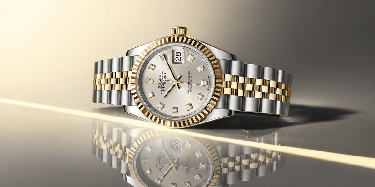
You’ve been eyeing Rolex Datejust two tone diamond dial ladies watches, but are they worth the money?They range in price from $15,000 for used watches